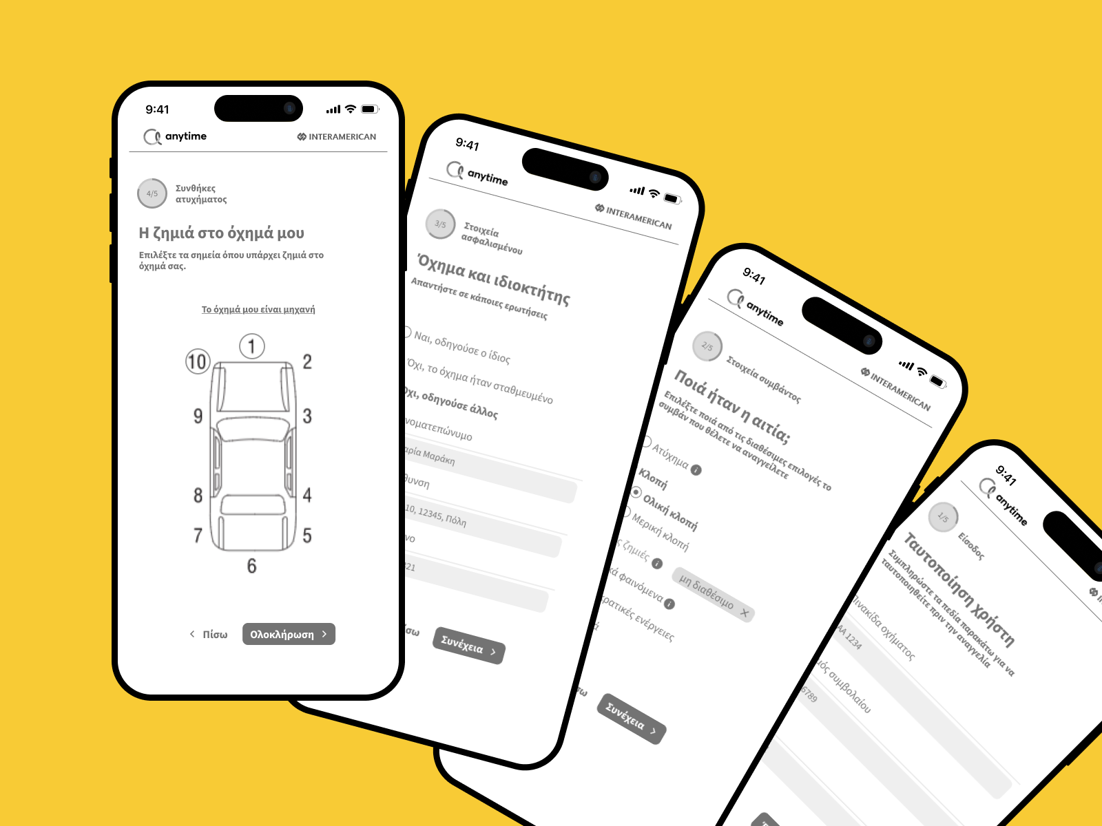
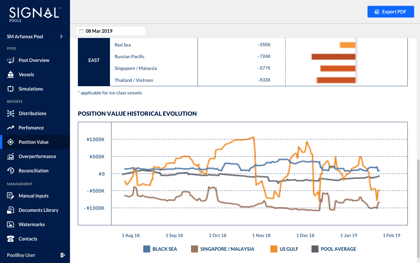
Reporting & administration tool
This tool is a web-based platform, that features multiple administrative dashboards. It facilitates three main categories of work: monitoring, reporting and managing operations.
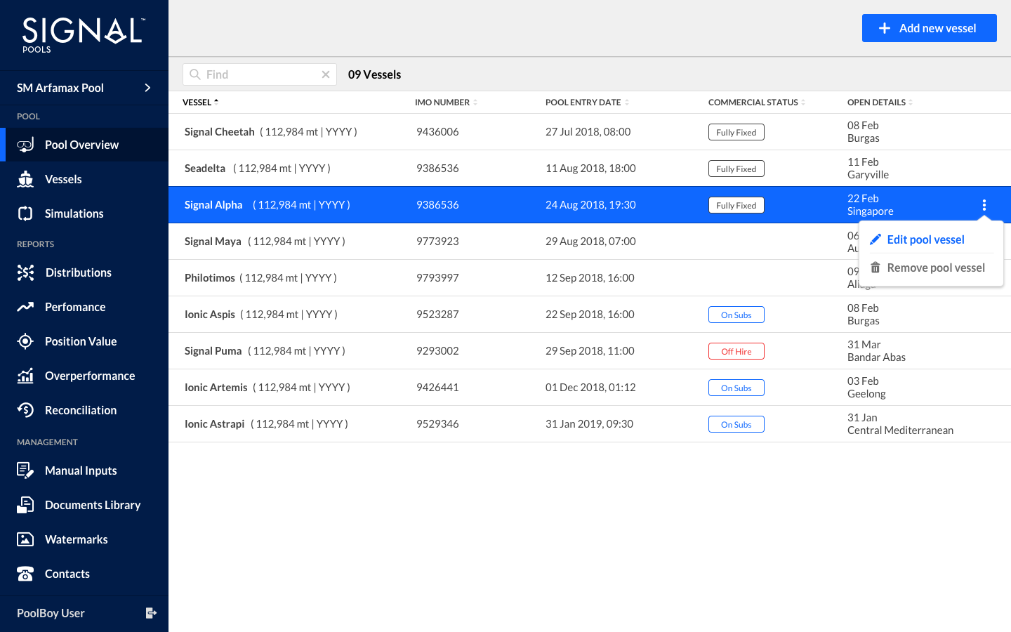
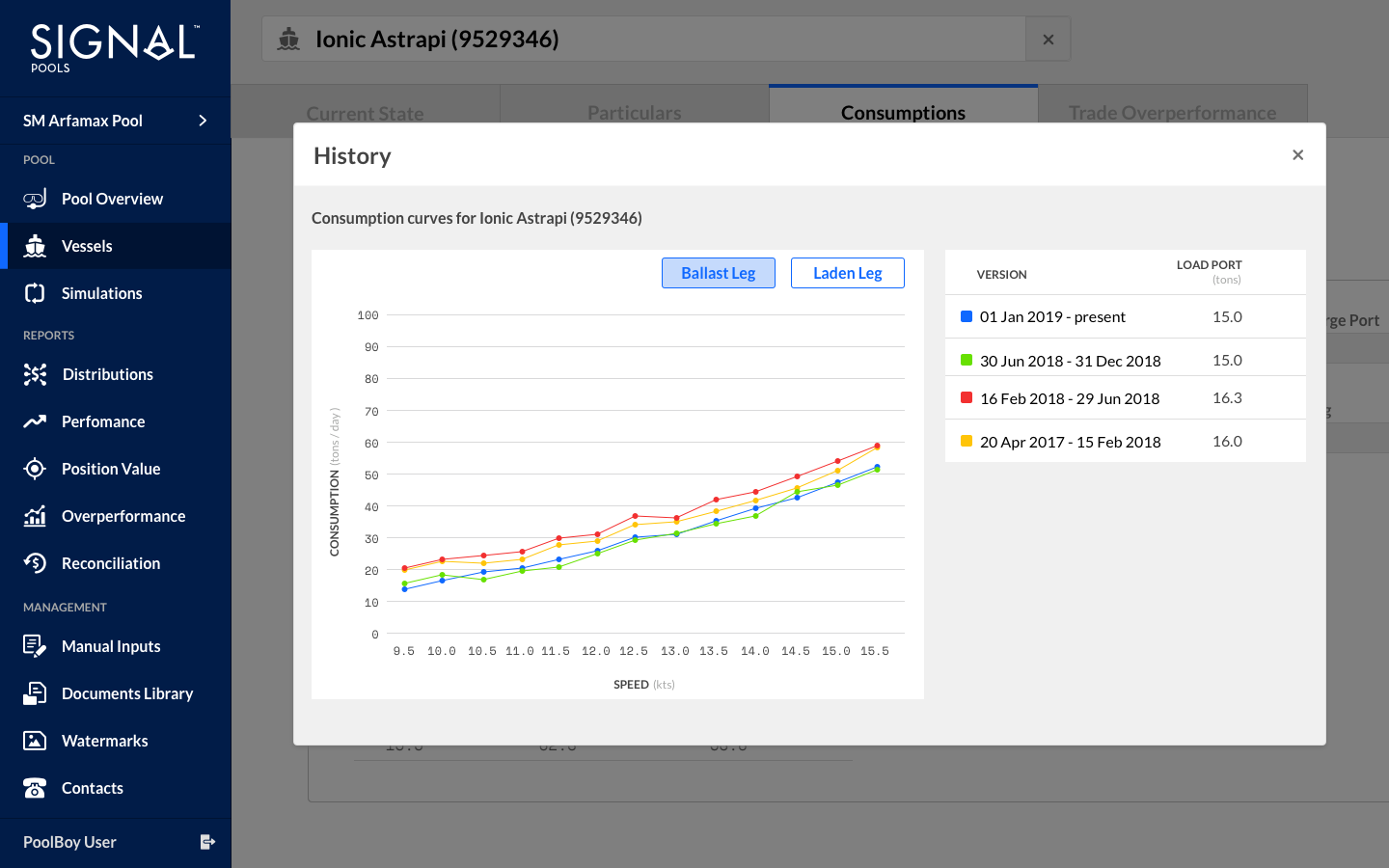
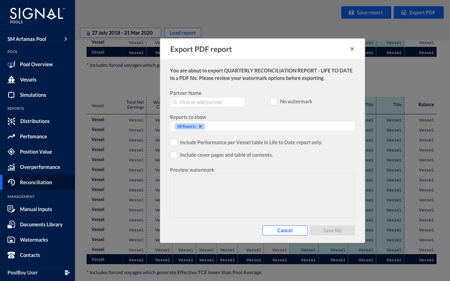
For the reporting part, this tool gives the user the ability to create datasets and export several different reports. The final exported PDFs contain mainly tables and graphs. They were based on templates, that were designed separately in Adobe InDesign and are not presented within the interface.
Users were juggling multiple dashboards, manual data entry and inconsistent formats. They had to build reports in tables/graphs separately, export them and send them to partners. Common problems included mistakes in data, wasted time assembling reports, high stress under deadlines.
The Design Challenge:
Create a heavy duty tool, with a light interface, self-driven UX and a playful twist, to make a very stressful job less error prone and more delightful.
Tools that are information heavy don’t have to be oppressive — small design decisions (layout, feedback, error handling, visual clarity) can make big differences in user comfort and efficiency.
My contribution to the product:
- End to end creation of UX/UI, testing and iterations.
- Full responsibility of new features, improvements, changes in the flow.
- Co-operation with the development team every step of the way to ensure the end result.
- Added “playful” touches: micro animations on hover or tooltips, friendly language in error / confirmation messages, clean and consistent typography and spacing to reduce visual clutter.
- Document design (one pagers and booklets) to accompany reporting outputs, aligning them visually with dashboard styling so reports feel like part of the same ecosystem.